US Energy Flows — Inputs and Outputs 1995 to 2010
I like to talk about the big picture of energy occasionally here. I also love data! Today, I’m not going to do a whole lot of talking at all. I mainly want to show you what I consider to be one of the most informative energy diagrams about energy flows in the US. Technically, they’re called Sankey diagrams, the most famous of which shows the losses that Napoleon suffered when he invaded Russia.
The Sankey diagrams below show the amount and types of energy sources we use here in the US, the inputs on the left side, and the ways that we use the energy — residential, commercial, industrial, transportation, and exports — the outputs.
I’ve got 5 different years of flows to show you: 1995, 1998, 2003, 2007, and 2010, so here they are. You can click on them to see them larger. Feel free to download and save them since they’re from the US Energy Information Administration, a part of the Department of Energy.
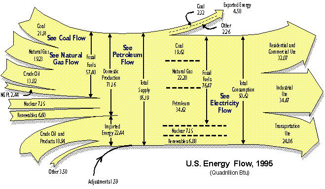
1995
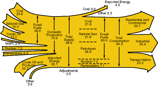
1998
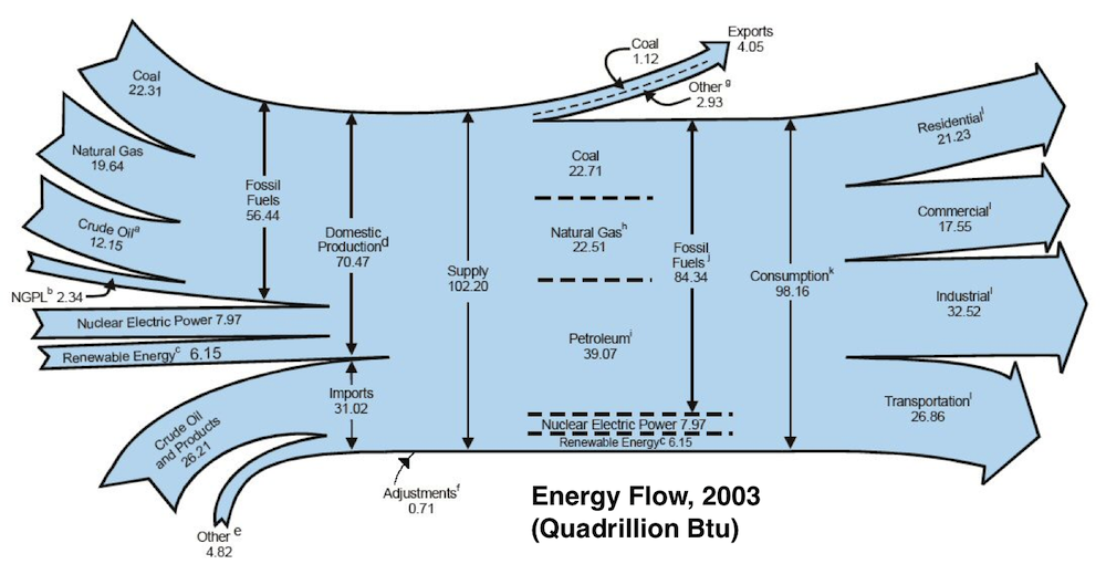
2003
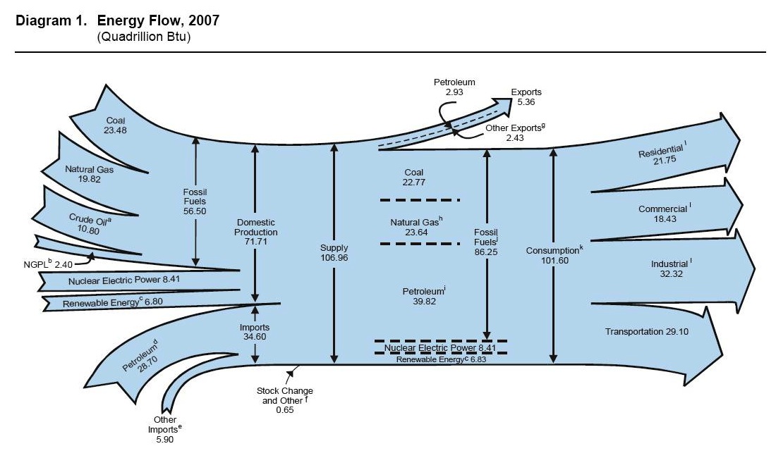
2007
 2010
2010
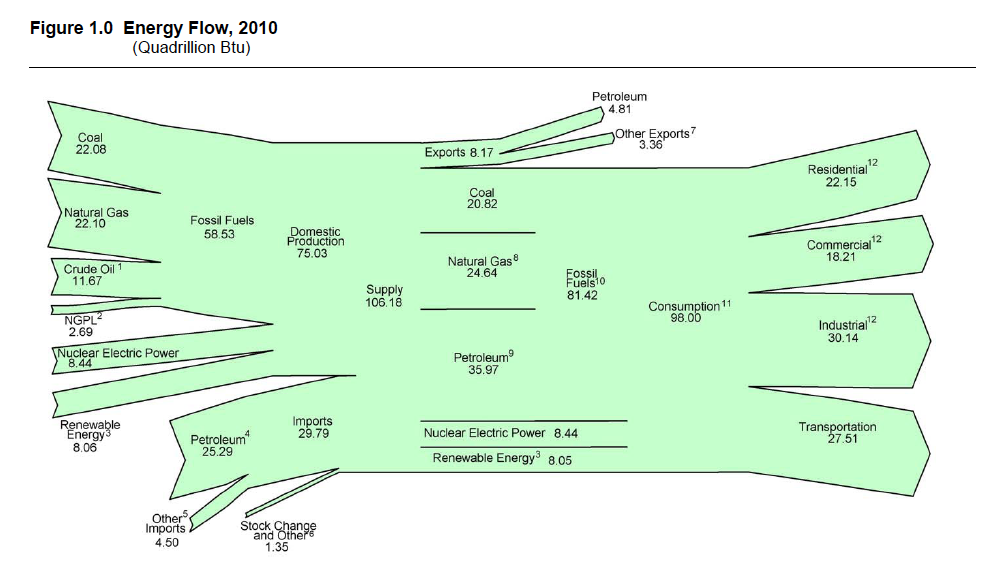 Understanding the proportions of energy flows is helpful. A few conclusions we draw from looking at these diagrams are:
- We use a lot of fossil fuels – 83% of what we consume.
- Recession is good for saving energy, although painful in other ways. Our consumption is down from 101.6 quads to 98.0 quads from 2007 to 2010, a drop of 3.5%.
- Industrial and transportation went down the most since 2007. Residential energy use actually went up slightly.
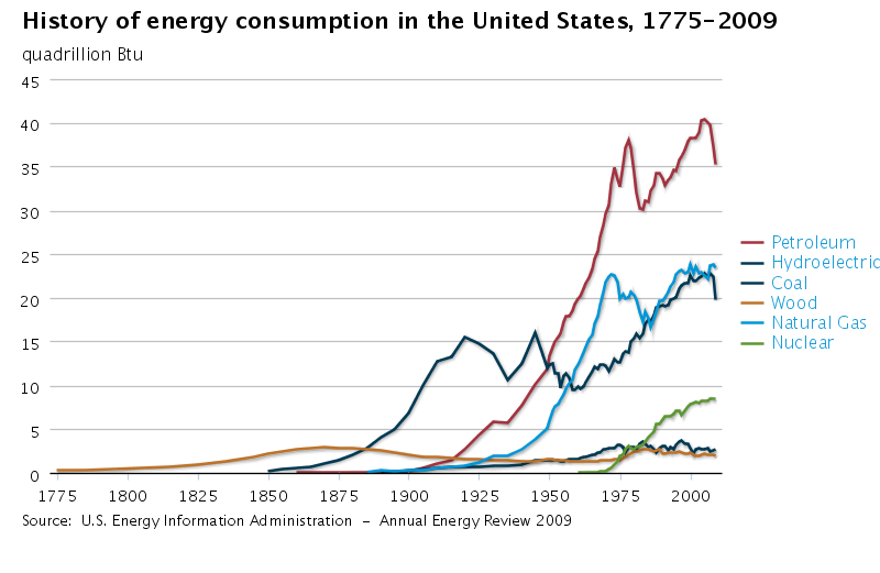
What would be really interesting is if someone put together diagrams like this all the way back to the founding of the US and then turned them into a video so you could see the changes in inputs and outputs happening gradually, from the small amount of wood that we used in 1776 to the large amounts of fossil fuels we use now. The graph below gives you a feel for how things have changed.
Interesting stuff, eh?
Allison A. Bailes III, PhD is a speaker, writer, building science consultant, and the founder of Energy Vanguard in Decatur, Georgia. He has a doctorate in physics and writes the Energy Vanguard Blog. He also has a book on building science coming out in the fall of 2022. You can follow him on Twitter at @EnergyVanguard.
Related Articles
Where Does Your State Rank in Energy Efficiency? ACEEE Can Tell You
Comments are closed.
This Post Has 15 Comments
Comments are closed.
Would be interesting to see
Would be interesting to see population superimposed over the last diagram (to show the disproportionate/exponential increase of energy use per capita).
It would be also interesting
It would be also interesting to add in renewables to the graphs.
Bradley:
Bradley: Yes, that would indeed be interesting! I’ll bet someone out there has done something like that.
Steve L.: Renewables are in the diagrams. In the 2010 version, they account for 7.6% of our supply. Look a little closer if you missed them the first time. If you click the any one of them, you’ll be taken to the page with the larger versions.
Thanks for this, Allison.
Thanks for this, Allison. ‘Makes me sad to see that renewables have made so little progress in the past 30 years.
Yes, the renewables are on
Yes, the renewables are on the charts, but not on the graph. It would be interesting to see how renewables have increased over the last 30 years.
Melissa B.
Melissa B.: You’re welcome. It’s hard to compete against ‘easy’ energy with a high energy return on energy invested (EROEI) and all the advantages of incumbency.
Steve L.: Ah, thanks for correcting my mistaken interpretation of your statement. I’m sure the EIA has a chart like that somewhere, but I imagine that even with all the growth of wind and solar over the past 3 decades, it probably barely registers when compared with the other sources shown there.
I think it would be much more
I think it would be much more interesting to be able to see more of a stratified display of each of the main outflow categories for the same time period (e.g., for residential: heating, AC, DHW, electric baseline). I suspect that the residential increases in this timeframe have much more to do with increased AC and entertainment (computer equipment, phones, video equipment) costs – which will probably grow over time regardless of the economy in general.
Good stuff. Is the curve for
Good stuff. Is the curve for total US energy consumption (the sum of the curves shown) continuing to increase or is it flattening at all? Presumably exporting energy intensive manufacturing to China etc has had some effect as well as energy efficiency measures?
Relatedly, a very cool, Sankey-style, interactive view of the world energy outlook to 2050 by the International Energy agency is available at http://www.iea.org/etp/explore/#.UCoBFBkbgA4.twitter
Bradley,
Bradley,
“>Here is a link to a blog post by Gail “the actuary” Tverberg containing several graphs and some discussion on per captia energy consumption.
It may not be quite what you asking to see since she uses world data and not just data for the US – but it is nevertheless interesting.
Oops,
Oops,
Looks like I made a typo.
Here is the link in a less confusing format.
http://ourfiniteworld.com/2012/07/26/an-optimistic-energygdp-forecast-to-2050-based-on-data-since-1820/
Allison, I can’t believe you
Allison, I can’t believe you didnt link to our famous article on Energy Flows:
http://mapawatt.com/2010/06/03/energy-flows/
As you suggest, it would be very cool to see how this changes over time!
This is a nice visual/data
This is a nice visual/data set. I am partial to LBNL version of energy flow trends which shows source inputs, flow to end uses, (residential, industry, transport, etc.) and reveals the huge amount of waste in each sector. The version that comes easily to hand is from a Washington Post post showing 2005 data.
David E.:
David E.: The US EIA has a lot of data, and they do track those kinds of end uses, too. That’ll have to be the subject of a different article, though, because this one focuses on the bigger picture flows.
Paul P.: I don’t know the answer to that question, but surely the loss of industry to other countries has had a significant effect on our energy flows. Thanks for that IEA link! It’s great, and for those who didn’t copy and paste, you can click below to see it:
IEA Data Visualization
Lucas D.: Thanks for that link, Lucas. Gail is very thorough in her analyses. I know her from when I used to go to the Atlanta Beyond Oil meetings. Here’s the clickable link for those who’d like to read it:
An Energy/GDP Forecast to 2050
Chris K.: Thanks for the link to your article. You used the Lawrence Livermore National Lab that Rana mentioned, which is indeed a bit more informative since it includes the “unused energy.”
Energy Flows in the Us
Rana B.: Yes, the LLNL diagrams do seem more complete since they include the “unused energy.” Here’s the clickable link to the article you referred to:
How Energy Actually Gets Used
Wow! I don’t know if I’ve ever written an article that’s prompted so many comments with links to related material. Thanks, everyone!
That last link doesn’t work
That last link doesn’t work above, so let me try again:
How Energy Actually Gets Used
Is there an updated chart of
Is there an updated chart of U.S. Energy Flow Trends/Net Primary Resource Consumption? The last one appears to be for 2002, created by LLNL back in 2004.
Thanks.